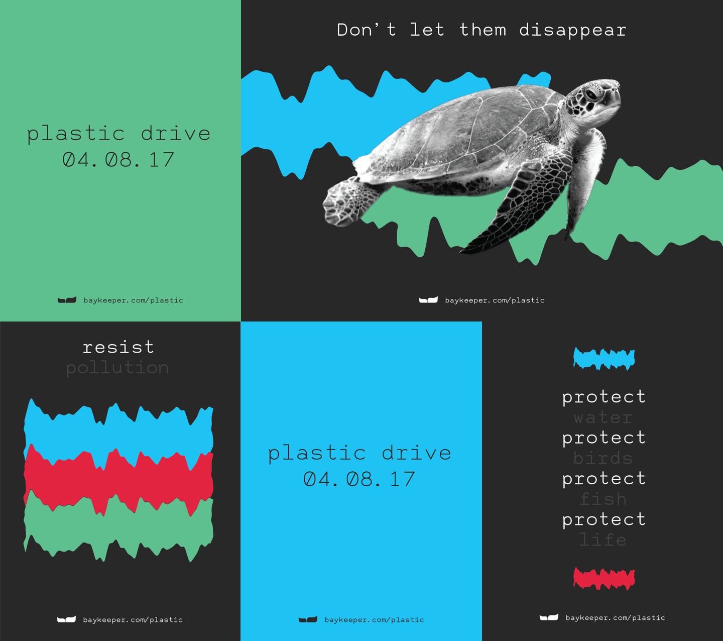
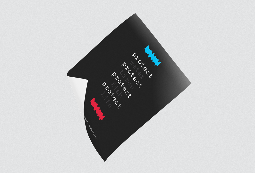
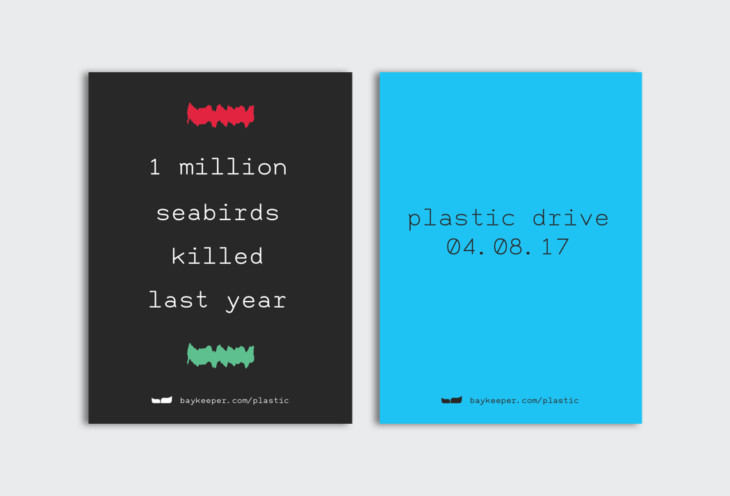
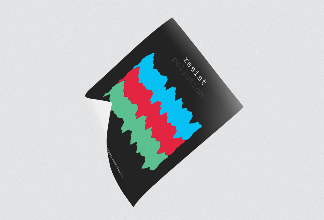
Visual system
Blue was chosen for the main color since it is the color of water and Baykeeper’s primary role is to protect the waters of the San Francisco Bay. There is a vibrant, web palette and then a darker, CMYK palette for print. The concept of the campaign visuals is a digital glitch or TV wave signifying that sea life is disappearing because of pollution. The vibrant color palette and the monospace type were chosen to reinforce this concept. Posters were designed both to stand alone and to live as a large set together, plastered on a wall.